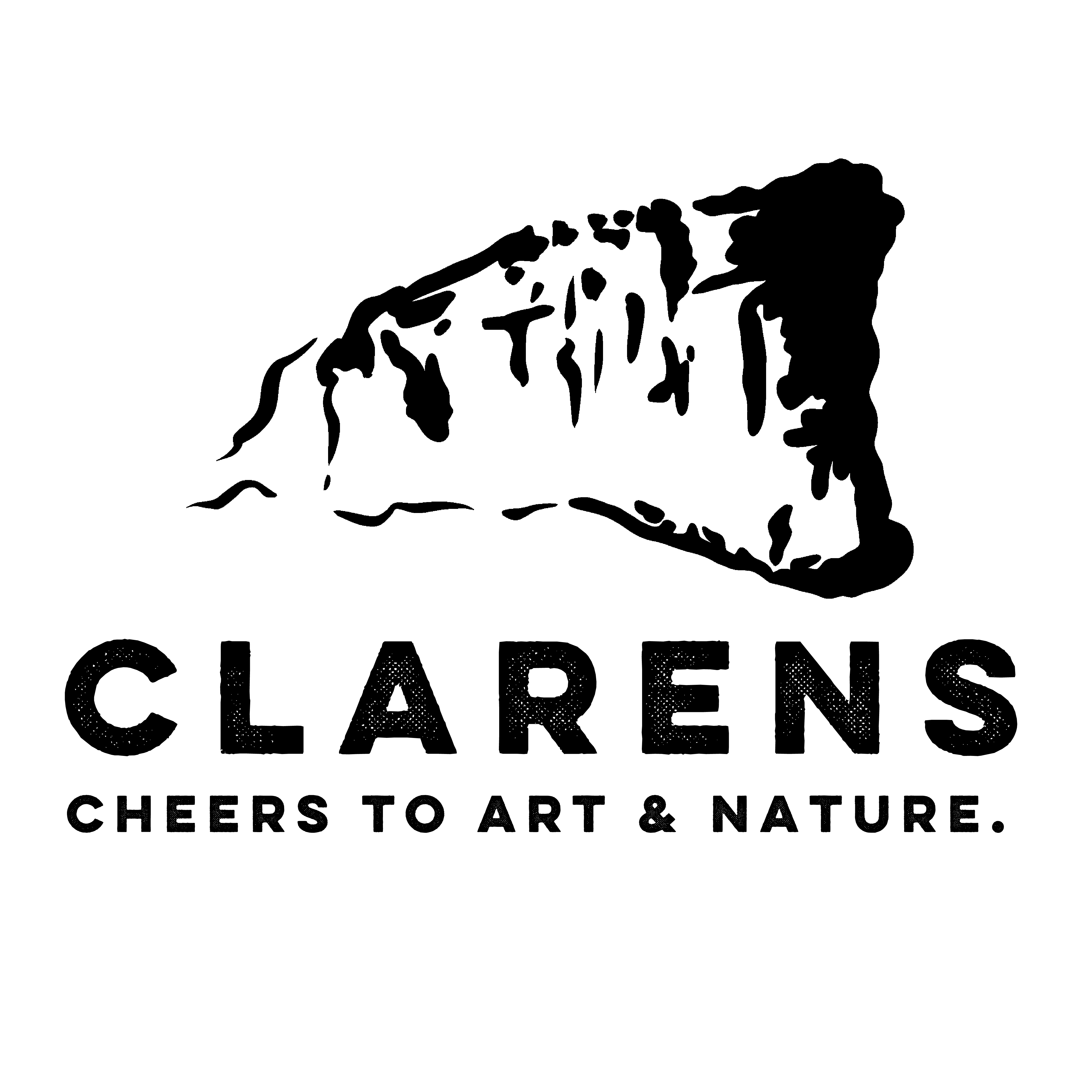
Clarens is a beautiful farm town nestled between sandstone mountains in the heart of the Free-State. The town is rich in craft brewed beers and ciders, art and natural landscapes. Thus, it deserved to have a brand identity worthy of it’s unique qualities. Something colourful, artistic and clean-cut in the way a mountaintop is.
Allowing the town to reach more of its target audience through an all-encompassing visual identity, as well as digital and collateral elements such as websites and merchandise. This new branding uses the big section of mountain jutting out that tells visitors that they are officially in Clarens, and thus is a sort of icon of the town.
The new colour scheme also plays into special aspects of the town, namely yellow for beer and cider, red-pink for cherries, greens for apples and nature, and blue for the beautiful sky views surrounding the mountains. Ultimately, the new bradning aims to ensure the town’s success for years to come.